Brand Guidelines
Logos
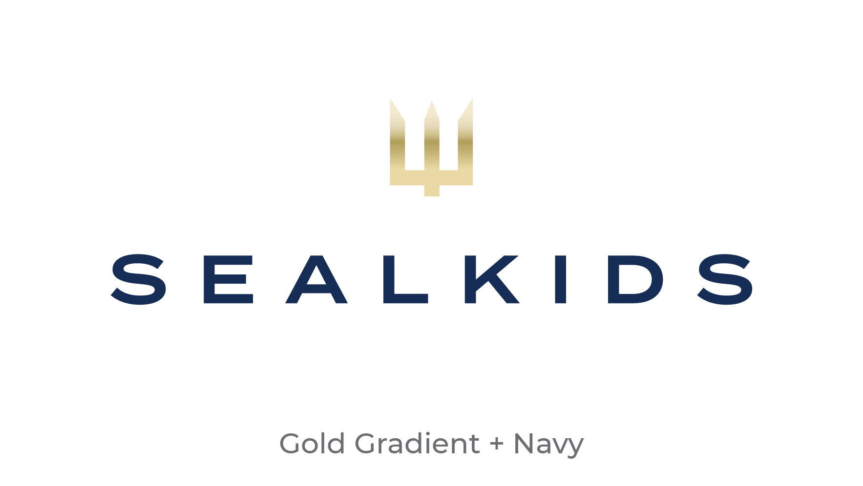
The SEALKIDS logo consists primarily of two elements: the trident icon, and the name, or signature, SEALKIDS.
We also have a special-use logo to commemorate our 10th Anniversary.
Clearspace
Maintaining ample clear space around the logo ensures that it remains legible, and doesn’t get lost within the composition.
Keep a minimum of 1X worth of space between the logo and other elements such as type, borders, edges and other logos. X is equal to the height of the icon.
Colorways
It is important to select the proper logo colorway to create legible contrast over the background. This is how logos should appear when on Light or Dark Backgrounds, respectively:
Typography
Our words carry weight, and so does our typography. The size, font, and style of typeface we choose is one of the most recognizable aspects of the SEALKIDS brand.
Type Hierarchy
Setting the proper hierarchy and combining font weights both play a significant role in making sure our type speaks loud and clear.
Here are a few examples of best practices:
Color
Our colors help to identify us at a glance.
Gold
PMS 871
RGB 169, 149, 76
HEX #a9954c
Navy
PMS 294
RGB 23, 45, 85
HEX #162d55
Gold Gradient
Creates a realistic gold look for logos and headlines.
Grey
80% Black
RGB 90, 90, 90
HEX #5a5a5a
Photography
Candid, in-the-moment photos express sincerity and humanity. This is the SEALKIDS photography style. Stay away from overly-staged photos.
Native Files
Below are examples that are available for download and use as a starting point for creating future promotional assets.
Brochure
Promotional Banner
The Essentials
Download all SEALKIDS logos, fonts, and templates in a single file.


